Help the premium fitness IP to refresh the Brand Image
The importance of creating a unified visual identity.
Client:
Quánlì (全力)
Deliverables:
- Brand Positioning
- Logo Design
- Graphic Design
The Story.
Since the rise of CrossFit — the high-intensity fitness program that combines weightlifting, cardio, and gymnastics — more comprehensive, community-based models of exercising have become increasingly popular around the world.
With the success and growth potential of a premium fitness in China, Quánlì (全力)recognised the importance of creating a unified visual identity to link them with each other and with their parent company. To achieve this goal, the brand enlisted The Orangeblowfish to upgrade its main logo and create variations for each IP.
Our goal was to upgrade Quánlì’s brand identity by designing a new main logo that could establish its connection with all its IPs through minor variations while still showcasing their distinct traits.
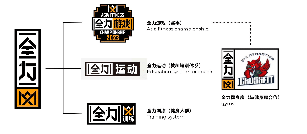
In 2019, Quánlì (全力), a premium fitness in China, introduced the first CrossFit world competition in Asia under the IP Quánlì Games (全力游戏), which is one of the company’s successful IPs. They are:
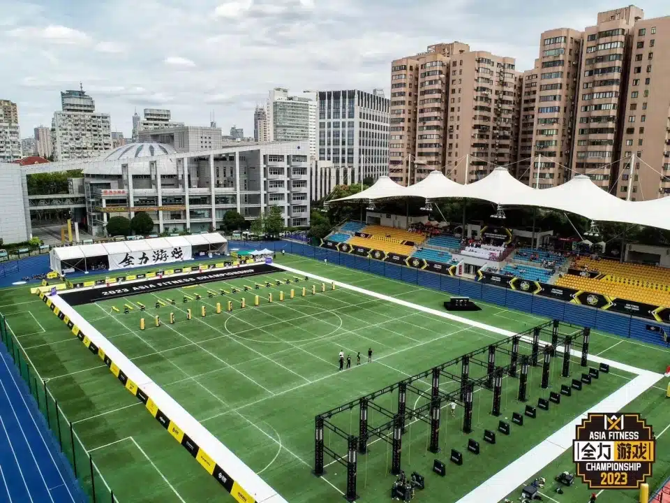
● Quánlì Games (全力游戏): the first regional event of the CrossFit world competition in Asia. It attracts top global CrossFitters to China to compete in a massive tournament held in Shanghai every few years.
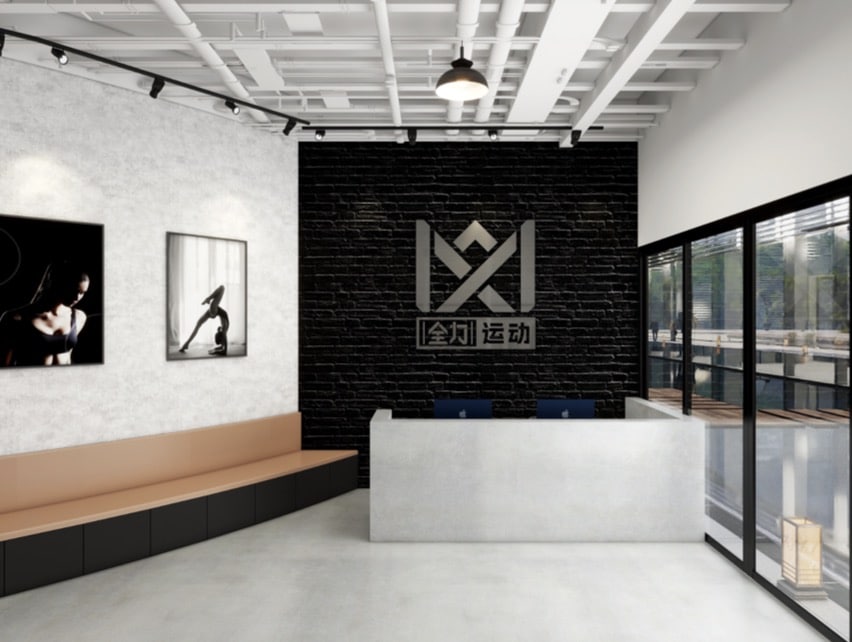
● Quánlì Sport (全力运动): a training program for aspiring and professional coaches run at Project One, a fitness centre in Shanghai. Quánlì Member Gym (全力健身房): an alliance of several fitness centres under the guidance of Project One and Quánlì aimed at the collective improvement of training practices and quality recruiting processes.
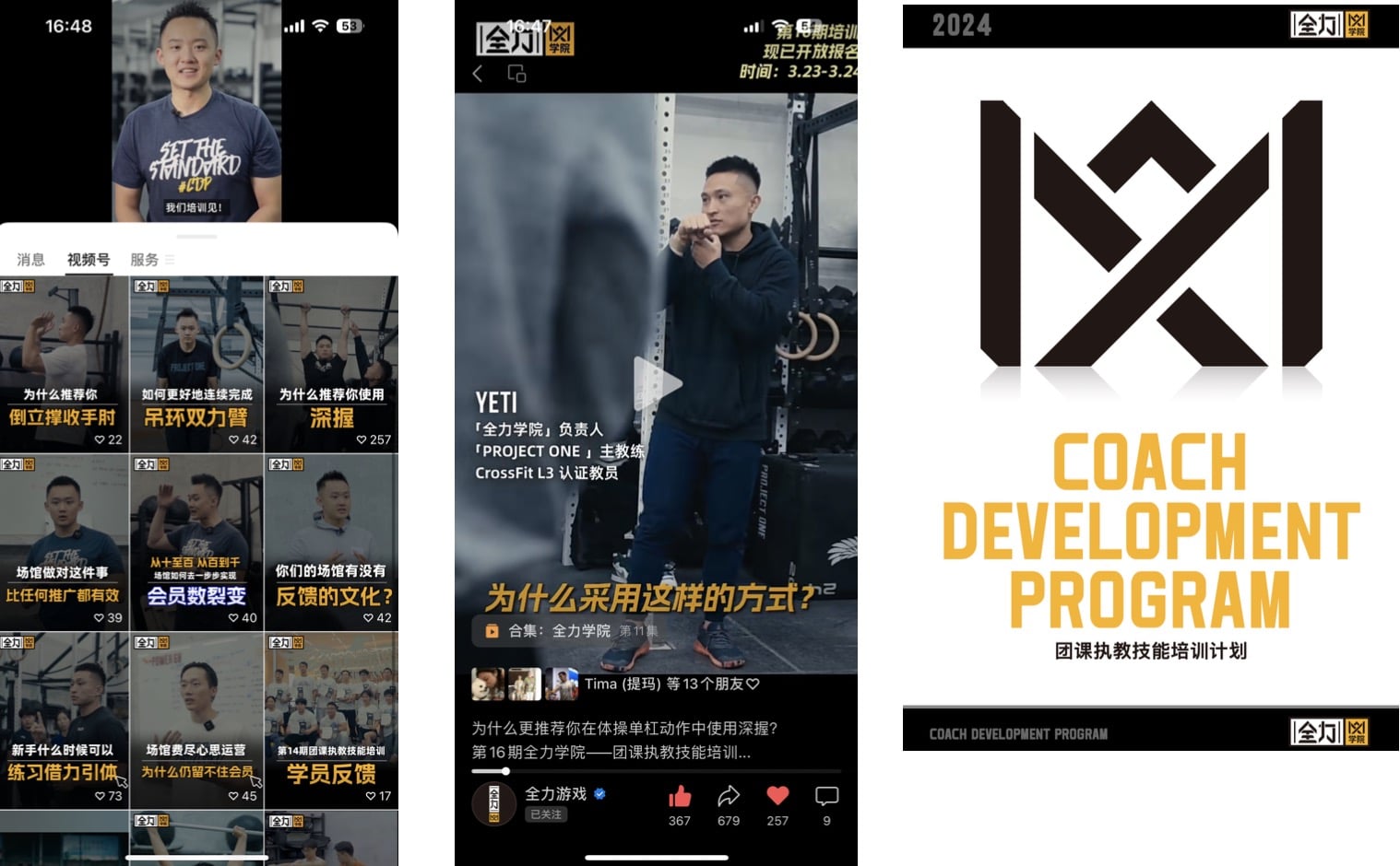
● Quánlì Training (全力训练): The goal of ” Quánlì Training ” is to provide an efficient, practical and accessible educational platform for Chinese fitness practitioners. Through self-operated courses, international master courses to improve the coaches and training.
Our Solution.
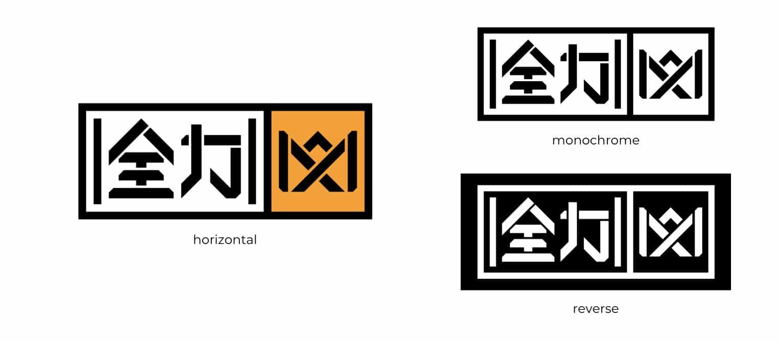
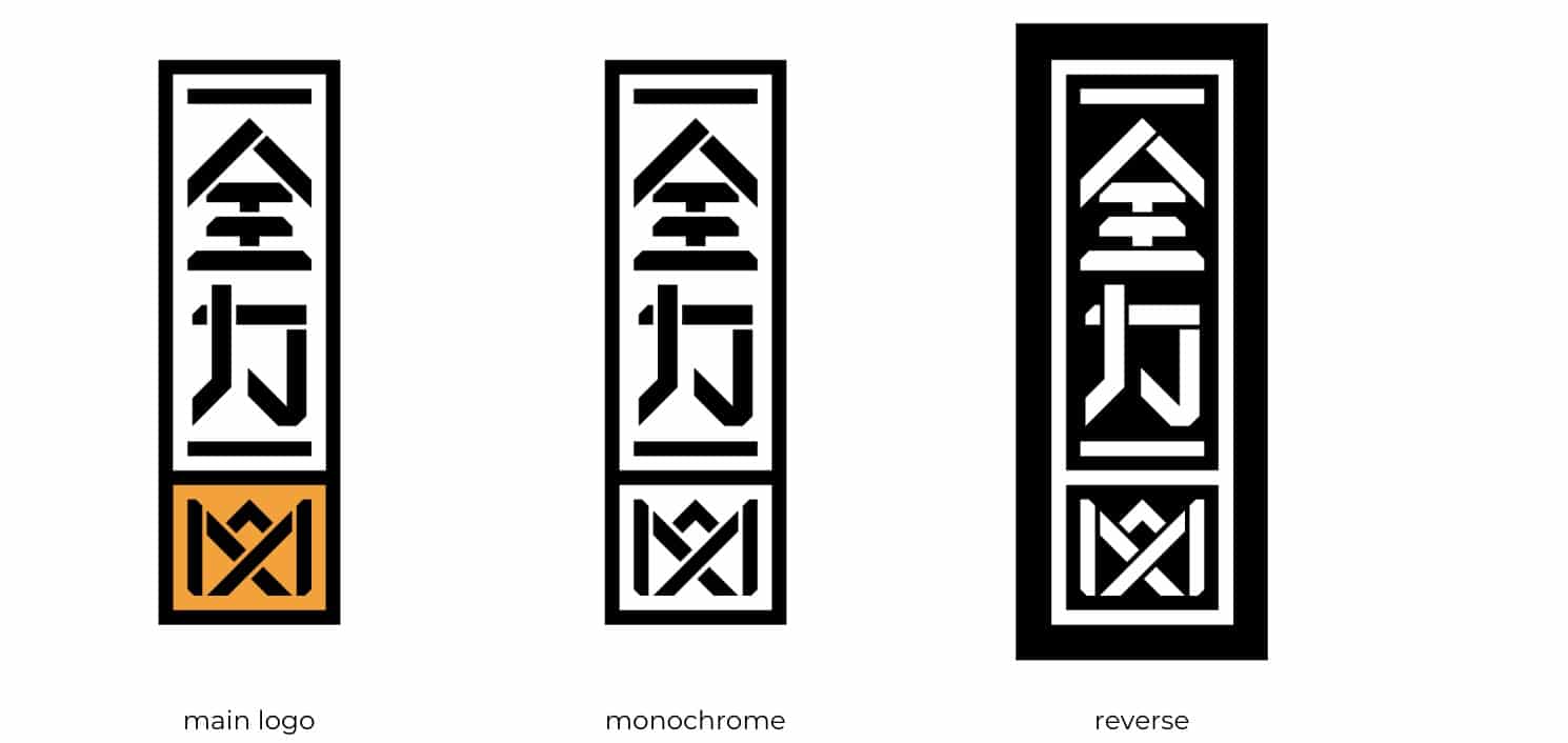
Like most major fitness brands, the logo we’ve designed for Quánlì’s parent brand is youthful and energetic in its vertical and horizontal iterations. Its frame structure draws inspiration from Chinese motifs and helps to evoke the vigour and tenacity common to members of the fitness community. The choice of yellow for the details added an extra sense of energy to the design.
We incorporated the name of Quánlì’s founder, Max, as a wordmark into the logo. This element was designed to look like a crown – the ultimate symbol of power.
With the three tips of the letter ‘M,’ the wordmark also resembles fitness equipment and alludes to the collaboration of the three founding partners, as well as the three main types of physical activities: aerobic, muscle strengthening, and bone strengthening. Its elements function independently, conveying flexibility and adaptability.
In this project, we came up with not just a single logo but a full concept that could also be used across the brand’s different IPs. As such, each IP gained its individual logo that stems from the logo of the parent company.
The Results
The result is a simple and memorable logo that stands out from the competition and can be adapted across IPs. It doesn’t matter where the logo appears; Quánlì’s brand identity keeps consistent and remains easily recognisable.